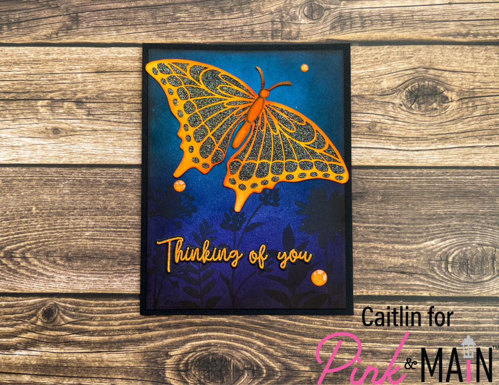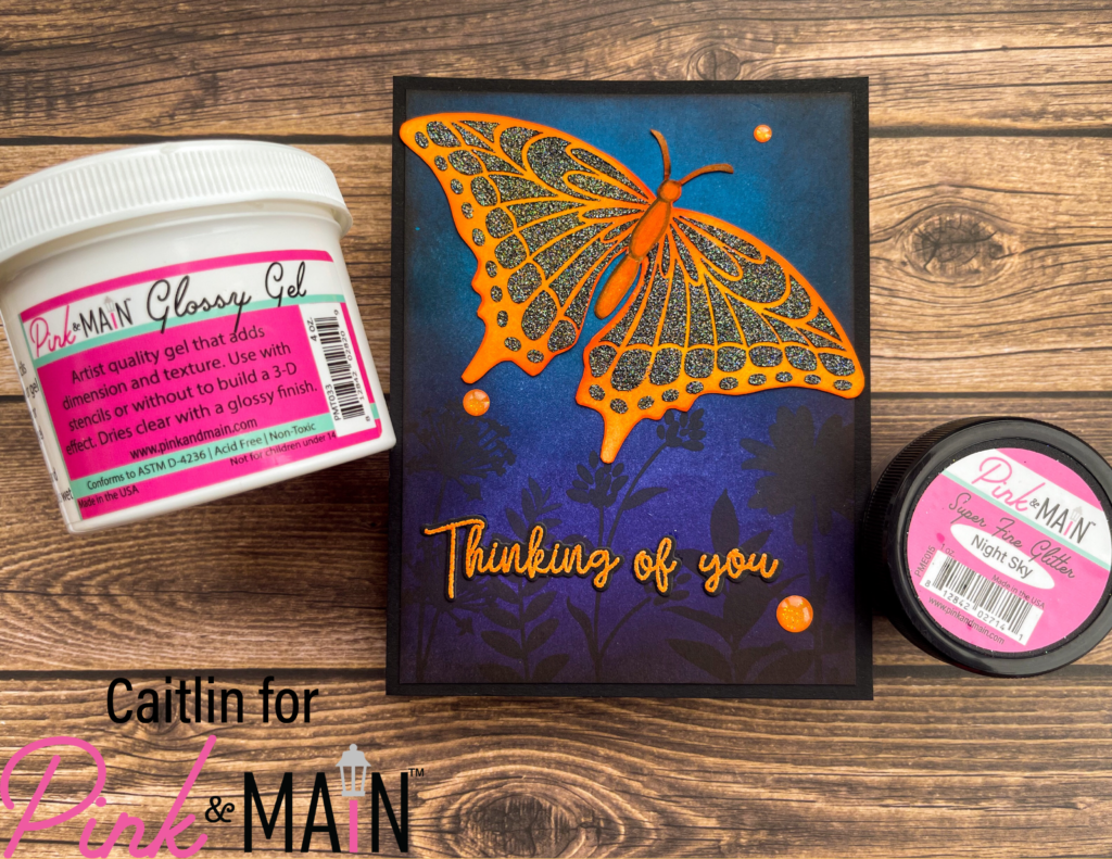
Hi Friends! This is Caitlin from CaitlinAnnaleeCards and I am sharing this card that plays on complementary colors and a strong contrast between light and dark. I started out by playing with the new Betty’s Butterflies Stencils, ink blending the bigger butterfly outline with distress inks. I blended Carved Pumpkin over the whole butterfly and then added in Crackling Campfire over the body and right along the edges of the wings. Next I made my own glitter paste to apply over the detail stencil layer by scooping out some Glossy Gel onto a pallet and adding in some Night Sky Super Fine Glitter. It’s really easy to mix the paste together and apply it with one of the flat Palette Knives, just scraping over the stencil evenly like frosting a cake! You have to make sure you rinse off your stencil and knife right away, so that the glitter doesn’t dry and stick forever!

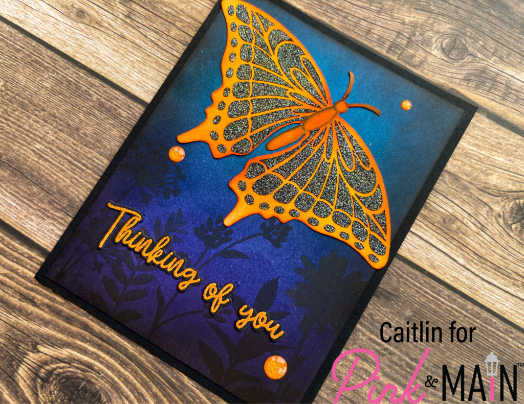
Once the paste was dry on the card stock, I added in some very simple Copic shading on the butterfly’s body, just following the outline of from the first stencil and then I fussy cut the whole thing out. Then it was time to decide on a background for and I knew right away that I wanted to create a deep blue and purple night scene to complement the bright orange and really make the butterfly pop. I trimmed down a panel of white card stock to be 5.25 in x 4 in and blended with more distress inks – Uncharted Mariner, Prize Ribbon and Villainous Potion. Then I blended around all the edges with Black Soot Distress Ink to create a vignette look. To really bring the whole background to life, I stamped 5 of the images from the Wildflowers 2 Stamp Set across the bottom of the panel with black ink. I really wanted my sentiment to pop off of the background and luckily, we have an amazing orange embossing powder, Orange Pop. So I stamped the Thinking of you sentiment from the Floral Spray stamp set with the Embossing ink and then heat embossed it on black card stock. These sentiments are amazing because they have coordinating dies, which I used to cut them out and glued the words and the butterfly to my card panel.

I adhered the ink blended panel to an A2 sized panel of the Asphalt (black) card stock and then you know it was time for bling! I decided to follow the rule of threes in two ways today – I wanted orange to be in three features and I did that by adding 3 of the orange glitter enamel dots from the All Occasion Enamel Dots. Between the glitter and complementary colors, this card really pops and has a lot of strong contrast. I hope it inspires you to make a bold card soon!
